
Guest Post for DatSci Awards 2017
As a finalist for Data Science Student of the Year, I was invited to write a guest blog post for the DatSci Awards. I had a lot of ideas but wasn’t entirely sure what would be most suitable. To get inspiration, I decided it would be a good idea to review what other DatSci bloggers had submitted before me (see here for previous posts). One way to do this is to close read each post in turn. Another way is to take a distant reading perspective, an approach which facilitates higher level comparisons to be made across all posts. In this case, I went with the latter as it allows me to demonstrate some simple text analysis techniques that can be used to gain insights about the type of blog posts being submitted.
Collect the Data
The first step in this approach is to collect the data for our corpus. In this case, I used a Python package called Scrapy:
Scrapy is an application framework for crawling web sites and extracting structured data which can be used for a wide range of useful applications, like data mining, information processing or historical archival.
Scrapy has great documentation and the code below is just an adaptation of the sample spider project they walk through on their tutorial page. The details that needed to be tailored specifically for the DatSci Awards site were the CSS Selectors. In order to know which parts of the page I needed to collect, I had to inspect the tags used within the site’s HTML. For example, to collect the Title of each blog post I used the following CSS Selector:
response.css("article h1.entry-title::text")
This means, return only the text contained between the <h1 class=entry-title> tags, which are themselves contained between the <article> tags of the page. The code in it’s entirety is as follows:
# Import scrapy library.
import scrapy

class BlogSpider(scrapy.Spider):
    # Name of spider.
    name = "blogs"
    start_urls = [
        # Link to home of all blog posts.
        'https://www.datsciawards.ie/news/',
    ]

    def parse(self, response):
        # Start on main blog page.
        all_posts = response.css("article")
        # Extract links to page of posts themselves.
        for href in all_posts.css("div.fusion-post-wrapper a.fusion-read-more::attr(href)"):
            # Follow links to post page to extract content.
            yield response.follow(href, self.parse_blog)

    def parse_blog(self, response):
        def extract_with_css(query):
            return response.css(query).extract()

        yield {
            'title'  : extract_with_css('article h1.entry-title::text'),
            # Third item in list is date for all pages.
            'date'   : extract_with_css('div.fusion-meta-info-wrapper span::text')[2],
            # * will visit all inner tags of p and li (<span><strong> <ul><ol> etc) and get text.
            'content': extract_with_css('article p *::text, article div.post-content li *::text')
        }
Once you have followed the guidelines for setting up a new project and have saved the code above as your spider, from your terminal, navigate to the same directory as your spider project and run:
scrapy crawl blogs -o blogs.json
This will save the title, date, and text content of each post in a file called ‘blogs.json’.
Analyse the Data
Now that we have our data, let’s import it into a Pandas DataFrame and begin to analyse it. For this part, I have also uploaded a Juypter Notebook containing the code which can be found here.
import pandas as pd

# Import blogs.json into pandas dataframe.
blog_file = 'blogs.json'
df_blogs = pd.read_json(blog_file)
To start, I’m going to preprocess the textual content of each blog post using a Python package called TextBlob:
TextBlob is a Python (2 and 3) library for processing textual data. It provides a simple API for diving into common natural language processing (NLP) tasks such as part-of-speech tagging, noun phrase extraction, sentiment analysis, classification, translation, and more.
The TextBlob processed text is stored in new column called blob_content in our df_blogs DataFrame.
from textblob import TextBlob

# Create new column in df where each row contains a concatenation of string lists collected from blogs.
df_blogs['text_content'] = df_blogs['content'].str.join(' ').str.strip()
# Create a column in df to store the TextBlob processed text for each blog.
df_blogs['blob_content'] = df_blogs['text_content'].apply(TextBlob)
To get an overall sense of the blog posts submitted to the DatSci Awards, I will visualize the word count and sentiment score of each post sorted by date. TextBlob makes this easy as it has inbuilt functions purposely built for these tasks.
- To get the word count of a blog I just need to apply the TextBlob function
wordsand find thelen(). - To get the sentiment score for a post, I can just use the TextBlob function
sentiment.polarity.
# Create a new column containing the number of words in each post.
df_blogs['word_count'] = df_blogs['blob_content'].apply(lambda blog: len(blog.words))
# Create a new column containing the sentiment polarity score for a blog.
df_blogs['sentiment'] = df_blogs['blob_content'].apply(lambda blog: blog.sentiment.polarity)
Plot the Results
To plot the results sorted by date, I’ll sort df_blogs by the date column and then set it to be the index of the DataFrame. I’ll then change the format of the date using t.strftime('%d-%m-%Y') (day-month-year) to eliminate seconds, minutes, and hours from appearing in the final plots.
def df_time_sort( df, dcol ):
    """
    Function for sorting DataFrame by date column and then setting
    date column as index with a d-m-Y format.
    """
    # Sort df by date
    df.sort_values(dcol, ascending=True, inplace=True)
    # Set the index to equal the date.
    df.index = df[dcol]
    # Change format of date to day-month-year.
    df.index = df.index.map(lambda t: t.strftime('%d-%m-%Y'))

# Call the df_time_sort function.
df_time_sort(df_blogs, 'date')
For the purposes of plotting, I’ll use a Python library called Matplotlib:
Matplotlib is a Python 2D plotting library which produces publication quality figures in a variety of hardcopy formats and interactive environments across platforms.
I’m also going to import the library Seaborn as this will automatically apply the default Seaborn plot style which I prefer to Matplotlib’s.
import matplotlib.pyplot as plt
from matplotlib import cm
import seaborn
The following function can then be used to produce the plots displayed in Fig. A and Fig. B below.
def senti_plots( df, norm_range , filename ):
    """
    Function for plottting sentiment and word count figures.
    """
    # Initate figure and set size.
    fig = plt.figure(figsize=(8,12))

    # The range of colours that I'm going to use for my plot.
    cmap = cm.get_cmap('viridis')

    # Normalise colour range.
    norm = norm_range
    # Create scalar mappable of colour map.
    sm = cm.ScalarMappable(cmap=cmap, norm=norm)
    # The actual bar plotting:
    ax = df['word_count'].plot(kind='barh', color=sm.to_rgba(df['sentiment']), linewidth=0, width=0.75)
    sm._A = []
    fig.colorbar(sm);

    # Add y-axis line
    ax.axvline(linewidth=3, color='black')

    # Set the font size of x-axis and y-axis tick labels.
    plt.xticks(fontsize = 14)
    plt.yticks(fontsize = 14)

    # Add x-axis and y-axis labels.
    ax.set_ylabel('Date', fontsize = 18)
    ax.set_xlabel('Number of Words', fontsize = 18)

    # Add 2016 and 2017 text annotation.
    ax.annotate('2016', xy=(3500,13), xytext=(3500,13), fontsize = 24)
    ax.annotate('2017', xy=(3500,17), xytext=(3500,17), fontsize = 24)

    # Add dividing line between 2016 and 2017 posts.
    ax.axhline(y=15.5, color='purple', linewidth=2, linestyle='--');

    # Save figure as pdf.
    fig.savefig(filename, bbox_inches='tight')
For Fig. A, I use the following parameters when calling the function:
# Normalise colour range between -1 (negative sentiment) and 1 (positive sentiment).
norm_A = plt.Normalize(vmin=-1, vmax=1)
# Define name of file to save figure as.
pdf_name_A = 'pos-sent-plot.pdf'
# Call senti_plots function.
senti_plots( df_blogs, norm_A, pdf_name_A)
For Fig. B, I modify the code to normalise the colour range between the minimum sentiment value and maximum sentiment value ([min sentiment = 0.102, max sentiment = 0.386]) recorded for our dataset.
# Color scaled between [min sentiment = 0.102, max sentiment = 0.386].
norm_B = plt.Normalize(vmin=df_blogs['sentiment'].min(), vmax=df_blogs['sentiment'].max())
# Define name of file to save figure as.
pdf_name_B = 'norm-sent-plot.pdf'
# Call senti_plots function.
senti_plots( df_blogs, norm_B, pdf_name_B)
By executing the code above we get the following figures:
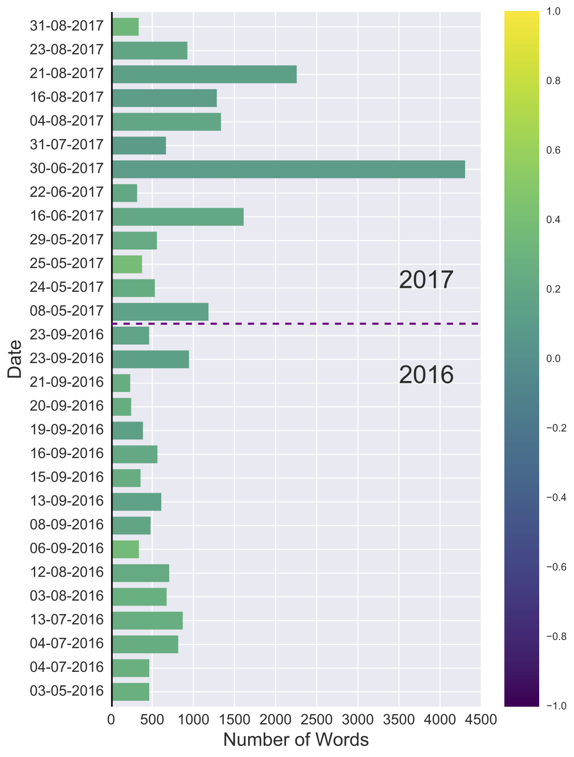
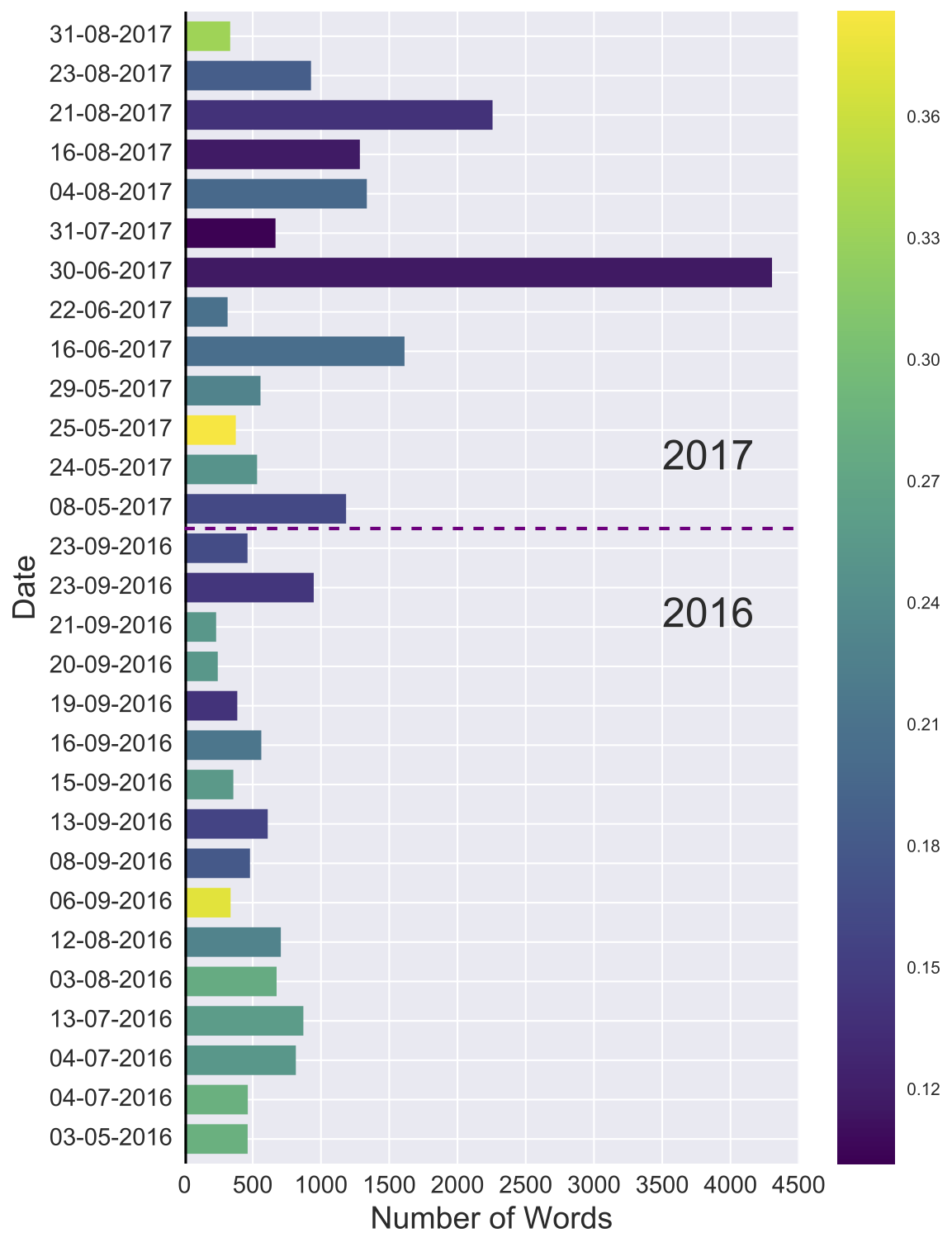
Fig. A provides a means of comparing the sentiment of the posts against the entire range of values that are possible. In the case of TextBlob:
- A value of 0 indicates a post is neutral in sentiment.
- Values that extend from 0 to -1 represent increasingly negative degrees of sentiment.
- While values that extend from 0 to +1 representing increasingly positive degrees of sentiment.
In Fig. A, all blogs appear green to light green in colour, reflecting that all posts are positive in sentiment and that this positivity has carried through from 2016 into 2017. In other words, it’s a nice visual representation of the enthusiasm shared by bloggers for Data Science and the DatSci Awards.
To get a better idea of how sentiment varies just within the corpus itself, I then replotted the same figure but with colour values normalised between the minimum sentiment (0.102) and maximum sentiment (0.386) recorded for our dataset. In this case, two posts stand out, both appearing bright yellow in colour. We’ll come back to these later to find out what the authors were talking about.
Another result that stands out from the figures is that there is one post appears to be 4 times larger than the rest. To find the average word count of each post and other summary statistics, I used pandas.DataFrame.describe:
Generates descriptive statistics that summarize the central tendency, dispersion and shape of a dataset’s distribution, excluding NaN values.
by executing df_blogs.describe() to produce the table in Fig. C.
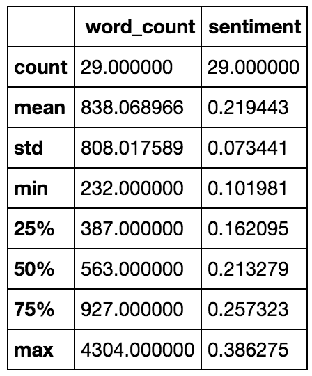
- Count gives the number of blog posts that are currently available on the DatSci Awards website. Hence, it is the same, 29, for both the
word_countandsentimentcolumns. - The mean
word_countis 838 words, while the max is 4304, which is in fact not 4, but over 5 times larger than the average post. - While the min
sentimentof 0.102 is indeed within the positive range of values.
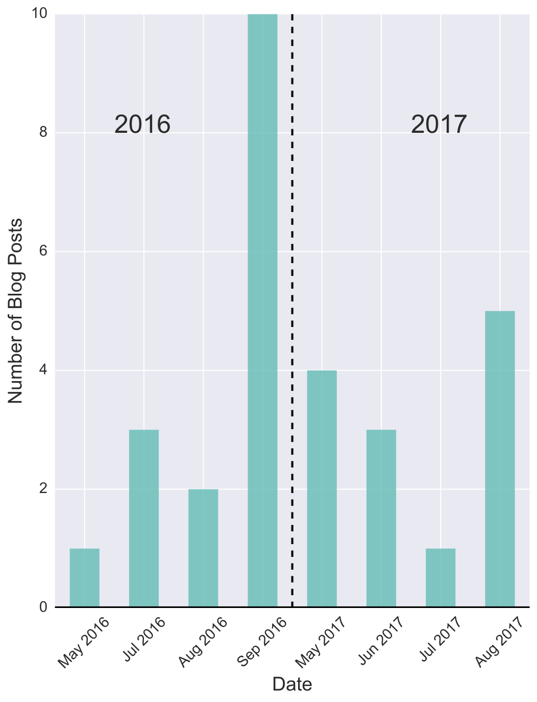
Fig. D depicts the number of blog posts that are published per month. We can see that the DatSci Blog was active between the months of May and September last year. This coincides with the DatSci Awards season, from the announcement of submission deadlines, right up until the awards ceremony itself held in September. In fact, the last two blog posts of 2016 occur the day after the awards ceremony held on the 22nd September 2016.
The next post appears at the start of May 2017, denoting the start of the new DatSci Awards season. So, even if you have no idea what the data is representing, we can see that whatever it is is seasonal. So far, 2017 has had 13 blog submissions, 7 more than for the same time period last year. Given the trend, I think it’s likely that 2017 will have a higher number of posts than 2016, but will it also beat the highest number of submissions in a month currently held by September 2016 with 10 posts? I guess we’ll have to check back in 30 days time to find out.
For completeness, I have included the code for producing Fig. D below. Note that from datetime import datetime is required, while the function itself is called by month_hist(df_blogs, 'month_count.pdf').
def month_hist( df, filename ):
    """
    Function to plot the number of blog posts that occurred each month.
    """
    # Initate figure and set size.
    fig = plt.figure(figsize=(8,10))

    # Sort df by date.
    df.sort_values('date', ascending=True, inplace=True)

    # Group by year and then group by month. Then count the results and plot as a barchart.
    ax = df['date'].groupby([df["date"].dt.year, df["date"].dt.month]).count().plot(kind="bar", color='teal',  alpha=0.85, linewidth=0, width=0.5)
    # Add x-axis line
    ax.axhline(linewidth=3, color='black')

    # Set the font size of x-axis and y-axis tick labels.
    plt.xticks(fontsize = 14)
    plt.yticks(fontsize = 14)

    # Add x-axis and y-axis labels.
    ax.set_xlabel('Date', fontsize = 18)
    ax.set_ylabel('Number of Blog Posts', fontsize = 18)

    # Change the format of how the dates display.
    labels = [item.get_text()[1:-1] for item in ax.get_xticklabels()]
    labels = [datetime.strptime(item, '%Y, %m').strftime('%b %Y') for item in labels]
    ax.set_xticklabels(labels, rotation=45)

    # Add 2016 and 2017 text annotation.
    ax.annotate('2016', xy=(8,1), xytext=(8,1), fontsize = 24)
    ax.annotate('2017', xy=(8,5), xytext=(8,5), fontsize = 24)

    # Add dividing line between 2016 and 2017 posts.
    ax.axvline(x=3.5, color='black', linewidth=2, linestyle='--');

    # Save figure as pdf.
    fig.savefig(filename, bbox_inches='tight')
What are DatSci Bloggers Writing about?
So far, we know:
- When DatSci bloggers like to post,
- How long their posts tend to be, and
- The sentiment of their posts.
But we still have no idea as to what they’re actually writing about. As of right now, if you didn’t know the source of the data, it could be anything from summer travel diaries to movie reviews (where all the movies so far have been good). Or even if you do know the source, posts could still be potentially irrelevant to the DatSci Awards themselves. To address this, I’m going to apply a method known as Term Frequency-Inverse Document Frequency or TF-IDF for short:
A numerical statistic that is intended to reflect how important a word is to a document in a collection or corpus.
This will allow us to examine what words are most important for individual blog posts in comparison to the overall corpus, and hence, will give a sense of the different topics DatSci bloggers like to cover.
Note 1: A portion of the code I will use next is an adaption of Steven Loria’s implementation which conveniently uses TextBlob, and who has written an informative blog post on the topic which can be found here. Comments at the start of code cells will denote when content has been adapted from Loria’s implementation.
Note 2: For those familiar with scikit-learn you might prefer sklearn.feature_extraction.text.TfidfVectorizer.
Before applying TF-IDF I’m going to further preprocess the corpus by removing common words such as the, and, I, my, is etc. These words are known as Stop Words and are usually removed as they generally provide little value when attempting to classify the content of a document. To do this, I will use the Python library Natural Language Toolkit (NLTK) stopword list.
from nltk.corpus import stopwords

# Use English stop words from NLTK
stopwords = stopwords.words('english')
# Convert text content into tokens (each word is a seperate item in a list.)
df_blogs['text_content'] = df_blogs['text_content'].str.lower().str.replace('[^\w\s]','').str.split()
# Remove stop words from content and store in a new column: nsw_content. (no-stop-words_content)
df_blogs['nsw_content'] = df_blogs['text_content'].apply(lambda x: [word for word in x if word not in stopwords])
# Convert stop word free text content into a TextBlob oject ready for TF-IDF
df_blogs['blob_nsw_content'] = df_blogs['nsw_content'].str.join(' ').str.strip().apply(TextBlob)
The following functions are taken from Steven Loria’s blog post will be used to compute the TF-IDF for each document.
# Adapted from http://stevenloria.com/finding-important-words-in-a-document-using-tf-idf/
import math

def tfidf(word, blob, bloblist):
    """
    Computes the TF-IDF score. It is simply the product of tf and idf.
    """
    # Computes "term frequency" which is the number of times a word
    # appears in a document blob, normalized by dividing by the
    # total number of words in blob.
    tf = blob.words.count(word) / len(blob.words)
    # Returns the number of documents containing "word".
    n_containing = sum(1 for blob in bloblist if word in blob.words)
    # Computes "inverse document frequency" which measures how
    # common a word is among all documents in the corpus (bloblist).
    idf = math.log(len(bloblist) / (1 + n_containing))
    return tf * idf
The next code sample demonstrates how I apply the above functions to the corpus and store the top 3 most important terms in a dictionary, where the keys of the dictionary are the blog titles.
# Adapted from http://stevenloria.com/finding-important-words-in-a-document-using-tf-idf/

i = 0
tfidf_dict = {}
# Iterate over each blog post.
for index, row in df_blogs.iterrows():
    i += 1
    # Compute TF-IDF scores for all words within each blog post.
    scores = {word: tfidf(word, row['blob_nsw_content'], df_blogs['blob_nsw_content'])
              for word in row['blob_nsw_content'].words}
    # Sort the terms so that more important terms are at the start.
    sorted_words = sorted(scores.items(), key=lambda x: x[1], reverse=True)
    # Concatenation list of strings in blog title column.
    title = (' ').join(row['title']).strip()
    # Save the top 3 terms for each blog as dictionary value where key is the title of the blog they are from.
    tfidf_dict[title] = [word[0] for word in sorted_words[:3]]
The TF-IDF dictionary is then converted into a DataFrame and merged, using the title column, to the original DataFrame.
# Concatenate sentence lists within blog titles.
df_blogs['title'] = df_blogs['title'].str.join('').str.strip()
# Store tf-idf dictionary created in the previous step into it's own Pandas DataFrame.
df_tfidf = pd.DataFrame(list(tfidf_dict.items()), columns=['title', 'tfidf_words'])
# Merge using title column the TF-IDF DataFrame with the original to create a new DataFrame.
df_mblogs = pd.merge(df_blogs, df_tfidf, on="title")
# Call the time sort function defined earlier.
df_time_sort(df_mblogs, 'date')
Finally, I adapted the previous sentiment plotting function, senti_plots, such that the top three most important words for each post would appear over their respective bar. In particular,
- I added
alpha = 0.6so that colours would be lighter,
# The actual bar plotting:
ax = df['word_count'].plot(kind='barh', color=sm.to_rgba(df['sentiment']), alpha=0.6, linewidth=0, width=0.75)
- A
forloop for annotating each post with their respective TF-IDF terms,
# Annotate tfidf terms onto each post.
    for val in range(len(df)):
        val_anno = val - 0.15
        ax.annotate((' | ').join(df['tfidf_words'].iloc[val]), xy=(100,val_anno), xytext=(100,val_anno),
                    fontsize = 12, weight = 'bold')
- I changed Seaborn’s style to remove the grey grid background so that text is more legible, and
# Change Seaborn style to a white background so that text is more legible.
    sb.set_style("whitegrid", {'axes.grid' : False})
    # Remove grey spline edges that occur as a result of changing seaborn style.
    ax.set_frame_on(False);
- The adapted function was then called using:
# Define name of file to save figure as.
pdf_name_C = 'norm-sent-plot-terms.pdf'
# Call senti_plot_terms function.
senti_plot_terms( df_mblogs, norm_B, pdf_name_C)
Which resulted in the following plot, Fig. E:
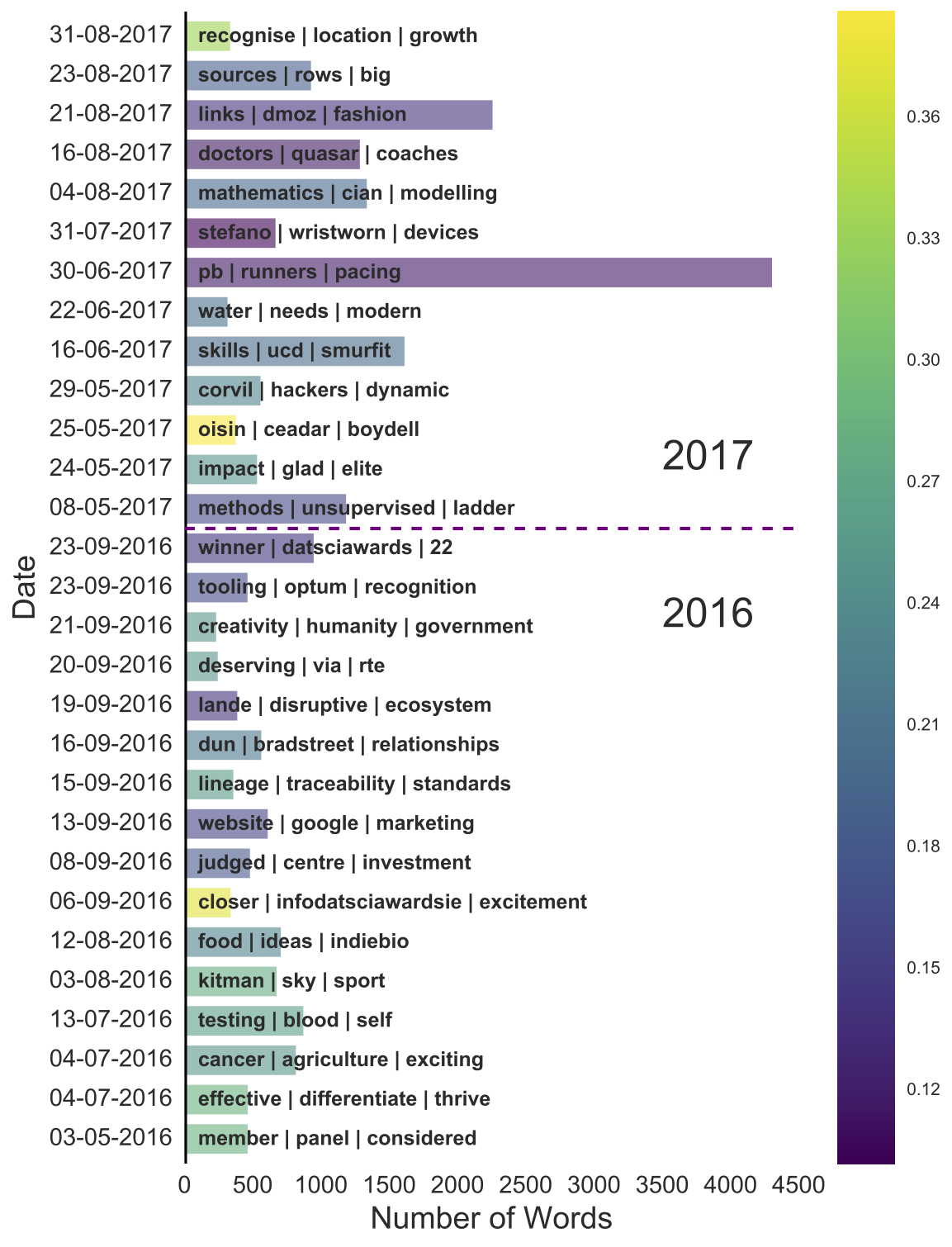
Immediately, our original sentiment figure becomes even more informative:
- The last post of 2016 is about who won: “winner - datsciawards - 22”.
- The longest post has: “pb (personal best) - runner - pacing” which aligns with Barry Smyth’s guest blog titled Using AI to Run your Best Marathon.
- We can now also see what the post with the highest positive sentiment is about: “oisin - ceadar - boydell”. This is in fact a post by a previous winner, Oisin Boydell, describing what it is like to have won as a part of the CeADAR research team.
- Finally, another nice finding, especially as someone that will be attending the awards this year, is that the sentiment of the posts by Paul Hayes, DatSci Awards compère, increases from 2016 (15-09-2017) to 2017 (31-08-2017). Clearly, the DatSci Awards were a lot of fun last year, as even the compère can’t hide their excitement for this years event!
Topic Modeling
The very last type of text analysis I’m going to conduct is known as Topic Modeling:
Topic modeling can be described as a method for finding a group of words (i.e topic) from a collection of documents that best represents the information in the collection.
Hence, although TF-IDF has provided insight into what individual posts are about, topic modeling builds on TF-IDF to learn what topics are common across multiple posts. In addition, since there are two years of data available, we can also investigate whether these topics changed between 2016 and 2017. Therefore, for this task I’m going to use a method known as Dynamic Topic Modeling via Non-negative Matrix Factorization, an approach developed by Dr. Derek Greene from the Insight Centre for Data Analytics, who in the spirit of open science has made the code freely available online.
First, I need to prepare the data so that it’s in a suitable format for the library to work. To keep things simple I’m going to break the data into two different time windows, one for each year.
# Directory names
dir_16 = 'data/blogs/year2016/'
dir_17 = 'data/blogs/year2017/'

# Check if directories exist, if not, create.
import os
os.makedirs(dir_16, exist_ok=True)
os.makedirs(dir_17, exist_ok=True)

# Label files with uniques id numbers.
i = 1 # 2016
j = 1 # 2017

# Iterate over each row in dataframe and store each blog's content in it's own file.
for index, row in df_blogs.iterrows():
    if '2016' in str(row['date']):
        blog_file = open(dir_16+'2016_document_'+str(i)+'.txt', 'w')
        i += 1
    else:
        blog_file = open(dir_17+'2017_document_'+str(j)+'.txt', 'w')
        j += 1
    blog_file.write(row['text_content'])
    blog_file.close()
Now I can start to follow the steps outlined in the ReadMe for the library.
Step 1 Navigate to the directory dynamic-nmf-master and execute the following:
python prep-text.py data/blogs/year2016 data/blogs/year2017 -o data --tfidf --norm
Step 2 I’m going to set k=2 so that the algorithm looks for 2 topics:
python find-window-topics.py data/*.pkl -k 2 -o out
Step 3 Finally, to view the results (see Fig. F and Fig. G) run:
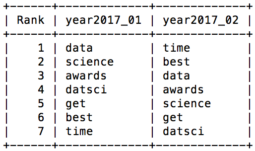
python display-topics.py out/year2016_windowtopics_k02.pkl out/year2017_windowtopics_k02.pkl
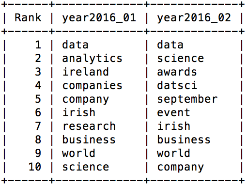
At first glance, the two topics in 2016 look very similar. So to make it a little more obvious and see if there are two distinct topics present, lets just look at the non-overlapping terms:
| 2016 Topic 1 | 2016 Topic 2 |
|---|---|
| Ireland Analytics Companies Research |
Awards DatSci September Event |
From the above table, the two topics that underlie the posts of 2016 become a bit clearer. Topic 1 appears to be concerned with analytics in Ireland in general, and how it is applied by both companies and research. Topic 2 is much more centered on the event of the DatSci Awards itself, taking place in September.
Both topics then shift in 2017 to become identical in their focus. How they change, in my opinion, is a reflection of how the relevance of the DatSci Awards has already been established in the previous year. There is no need to explain that data analytics is present in Ireland as they have already made that fact clear. Therefore, more concentration can now be placed on the event itself and the value that it brings to the Irish data science community, rather than having to prove that a data science community in Ireland exists.
Conclusion
To conclude, although this post has turned out slightly longer than I originally intended, I hope it has been informative both from an implementation point-of-view, and from the insights that were made along the way. It’s been great to get a bird’s-eye view of the diverse range of topics being covered by DatSci bloggers, and also visualise how the DatSci awards have inspired such positivity. For the complete code implementation and data behind this post, the repository can be found here. If you’re interested in learning more about the different open source libraries and tools available to data scientists, and how they’re implemented, then you should pop along to one of the PyData Dublin Meetups. These are held monthly and details of the next event can be found here.


Leave a Comment